Change everything.
Weeding through personal papers the other day, I came across several small index cards on which I had noted art project ideas. The cards date from the late 1970s, perhaps 1978 or ’79. I would have been 22 or 23, and at the time I was struggling to make sense of an artistic career. Until 1980 I was a student at Munich’s State Academy of Fine Arts, assigned to the Danish constructivist sculptor Robert Jacobsen‘s studio.
Within the context of Munich-style traditionalism, Jacobsen’s modernism (he was linked to COBRA) wasn’t celebrated as much as it was tolerated. So, while most of the Academy’s other sculpture students worked traditionally, I belonged to Jacobsen’s “far-out” gang, within which was the even smaller tribe I settled in: the people who read theory and were determined to elude what Theodor Adorno called “the culture industry.”
 And so, our work – my work – had to be challenging, and (because we were trying not to be co-opted) hermetic. But part of me hated the hermeticism, which, as the daughter of people who hadn’t even been able to finish high school because of financial pressures, I saw as elitism, pure and simple. Rather unfortunately, I fell into trying to square the circle (what an idiot I was) by trying to make challenging art that had pretensions to being politically correct.
Please don’t ask me what that actually could have meant. It’s blindingly obvious now that the average working class Joe or Jane (if s/he even exists) does not give a rat’s ass about high art. But at the time, I really believed (7/8ths-heartedly) that art could change people’s perception, and that by changing their perceptions, artists could change the world.
I could have been happier if I’d just dropped another tab of acid. But I digress…
I worked with packing cardboard, which was cheap, relatively plentiful, lightweight, and (this was important later) easy to toss. Working with cardboard on a fairly large scale allowed me to tackle things like spatial perception, which I hadn’t been able to test properly when I was still making models out of balsa wood. The cardboard essentially allowed for what we now might call rapid prototyping. It also allowed me to wander down some obscure paths…
At one point I began to introduce color into the cardboard constructions. From the index card headed The Blue Theme:
– the artist as reprocessor of information, even previously common-property information, i.e., hit pop songs
“Crystal Blue Persuasion”
Um, yah. Modernism and Mass Culture. Funny, I designed and taught a course on that at MIT many years later…
More on the color blue:
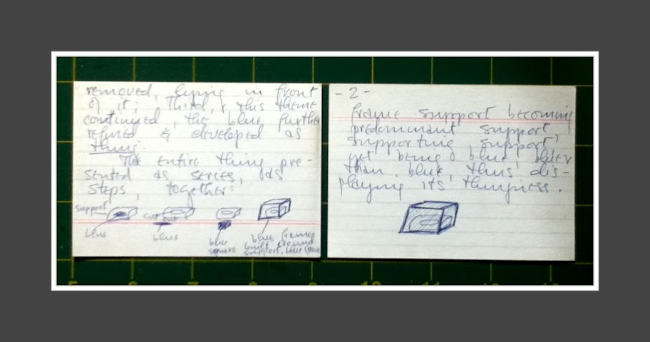
Colour as thing – back to the “blue theme”: make cardboard support surface sculpture, and apply the blue theme, blue stroke, blue surface, …whatever. Next, a second, identical support sculpture, the blue cut out removed, lying in front of it; third, this theme continued, the blue further refined & developed as thing.
The entire thing presented as series, as steps, together:
[and here there are tiny little sketches, as per photograph, below]
frame support becoming predominant support, supporting support, yet being blue, bluer than blue, thus displaying its thinginess.
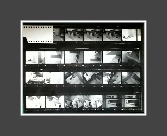
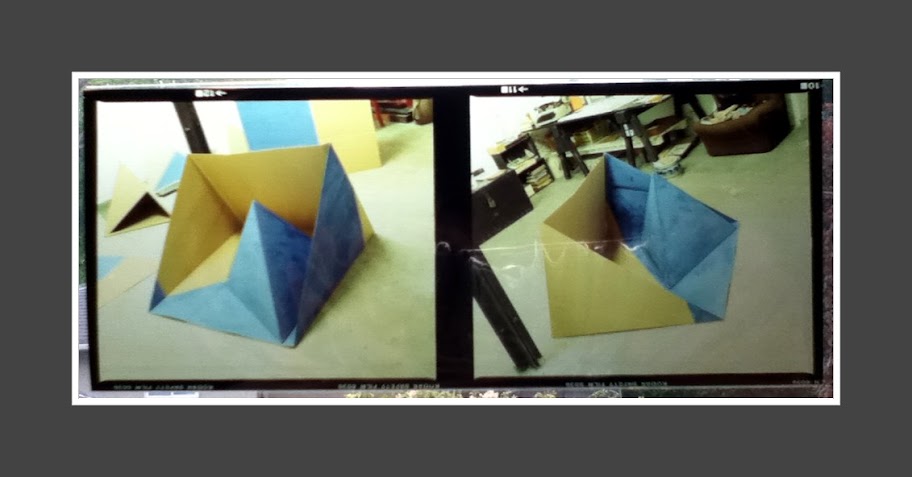
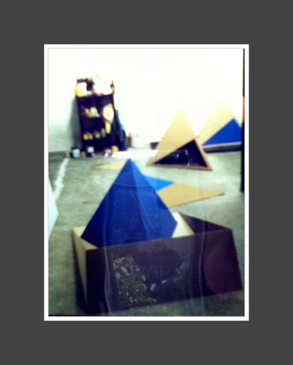
I built some pieces to approximate the idea. Below, some color slides (2 1/4 inch format), pardon the lo-fi quality… I just taped the positives to a window pane and used my iPod Touch to photograph them.
Another card, headed Yellow, but no evidence remains of any work carried out on this theme:
As the blue wedge triumphs over the cardboard triangle, geometric and hard-edged, so yellow must from the start be a wholly 3-dimensional shape, diffuse, being outside + objective and at the same time all-encompassing + therefore subjective. Like God, or a glass perpetually overflowing.
I was an atheist even then, so I’m not sure exactly how I meant that reference to god, except probably in reference to how other people experience transcendence.
Too much of what I was doing was about other people. What other people might think about my work if it was too conventional. Or too avant-garde. Or too hermetic. Or too political.
Or just weak and a not particularly strong artistically…
Another card, without a header. Maybe it should be Danger:
The incorporation of danger into an art work. The daily threats and anxiety experienced by the artist transposed into the work, making it a transmitter of that anxiety, that danger.
Well. Maybe I should have electrified one of my sculptures and dangerously and anxiously shocked viewers. I was thinking about electricity, albeit for a video piece (I was convinced at the time that video could be the new sculpture).
*
I still like the thoughts noted on this next card, a lot:
Infrastructure as art medium?
A card about the Paris Metro:
The Paris Metro as medium. All those buskers, beggars and theatre players, graffiti artists, etc., using the Metro so that it has become the ultimate transportation network: it transports ideas, music, events, information and people.
Yes, I still like this idea. Seems to me it’s indicative of a longstanding attraction to urbanism and cities.
I also have a number of index cards that detail my ideas about video. But they’re very obtuse (and if you read this far, you’re probably thinking, “More obtuse???”). When I worked on (or thought about) video (and to a lesser extent, photography), I tried to marshal time as an element of the video medium, which (as I noted above) I considered a new form of sculpture. It just got pretty hairy. Obtuser.
I think a lot of the same sort of obtuseness (hermeticism) my 22-year-old self expressed in 1978 still thrives in today’s art world. Alternatively (and quite possibly worse), it’s also ok for art to be entirely unserious and just “fun” or consume-able. Goes down easy. Doesn’t get stuck in your craw.
Too bad. I still like the idea of that glass, perpetually overflowing, though – a plenitude that changes everything.